


Στοχεύοντας στην περιεκτική εικονοποίηση της κατάστασης πραγμάτων στον παγκόσμιο ιστό σήμερα, ο Σλοβάκος graphic designer Martin Vargic ολοκλήρωσε μετά από σχεδόν ένα χρόνο δουλειάς καινούργιο Χάρτη του Ίντερνετ, ενημερωμένο έως το 2021. Σχεδιαστικά εμπνευσμένος από παλιούς χάρτες, ο Χάρτης του Ίντερνετ του Vargic καταγράφει τους μεγαλύτερους και πιο δημοφιλείς την περίοδο 2020-2021 ιστότοπους μαζί με τα αναρίθμητα χαρακτηριστικά τους.
Περιλαμβάνει πάμπολους ιστότοπους οι οποίοι απεικονίζονται ως χωριστές «χώρες». Ομαδοποιημένοι σύμφωνα με τύπο ή κατηγορία, σχηματίζουν περιοχές και ηπείρους που απλώνονται σε όλο τον χάρτη: «νέοι ιστότοποι», «μηχανές αναζήτησης», «μέσα κοινωνικής δικτύωσης», «ηλεκτρονικό εμπόριο», «adult entertainment», «file sharing», «εταιρείες λογισμικού».
Τα χρώματα των ιστότοπων είναι βασισμένα στα κύρια χρώματα των ενδιάμεσων χρηστών τους (user interface) ή των λογοτύπων τους. Πολλά από τα χαρακτηριστικά τους ή υπηρεσίες που προσφέρουν, τα τμήματά τους και οι κατηγορίες περιεχομένου τους, καθώς και δημιουργοί περιεχομένου, χαρακτηρίζονται ως μεγάλες πόλεις ή μικρότερες (όπως επισημαίνει το Trendland.com, αριθμούν πάνω από 10 χιλιάδες). Στον πυρήνα μπορεί να βρει κανείς τους φορείς παροχής υπηρεσιών στο διαδίκτυο (ISP) και τους περιηγητές ιστού (web browser) ενώ ο απόμακρος νότος είναι το βασίλειο του μυστηριώδους «dark web».
Οι ιδρυτές ιστότοπων και οι διευθύνοντες σύμβουλοι απεικονίζονται ως πρωτεύουσες, ενώ εκατοντάδες δημοφιλείς χρήστες μέσων κοινωνικής δικτύωσης και διασημότητες μπορούν να εντοπιστούν στις «χώρες» YouTube, Facebook και Twitter. Μια εκατοντάδα σχεδόν πρωτοπόρων του Ίντερνετ και της επιστήμης της πληροφορικής είναι παρόντες στον χάρτη δίνοντας το όνομά τους σε υποθαλάσσιες κορυφογραμμές.
Πίσω από το εγχείρημα είναι ο νεαρός – διανύει την τρίτη δεκαετία της ζωής του – Martin Vargic. O Παγκόσμιος Χάρτης του Ίντερνετ 2021 δεν είναι η πρώτη του σχετική προσπάθεια. Έχοντας ως πηγή έμπνευσης τον Map of Online Communities που σχεδίασε το 2007 ο ντιζάινερ Randall Monroe, ο Vargic δημοσίευσε τρεις χάρτες μεταξύ 2014 και 2015. Ωστόσο, όπως σημειώνει το Insider, σε εκείνους απεικονίζονταν περίπου 200 ιστότοποι, ενώ στον χάρτη του 2021 περιλαμβάνονται σχεδόν τρεις χιλιάδες· ένδειξη της υπερταχείας ανάπτυξης του ιστού και του αδυσώπητου ανταγωνισμού.
Τους αναλυτικούς χάρτες μπορείτε να δείτε εδώ.
There's so much information packed into our 2021 Global Internet Map that you might not know where to start.
You could begin by digging into the 35% growth we saw in international internet capacity—from around 450 Tbps to over 600 Tbps—between 2019 and 2020.
Or you could scope out regional connectivity intel, noting that Europe is the region with the highest regional capacity; it also saw the largest growth from 2019 to 2020.
Other notable findings include:
- Global Peak Traffic – Peak international internet traffic increased at a compound annual rate of 30% between 2016 and 2020.
- Global Average Traffic – Average international internet traffic increased from around 120 Tbps to 170 Tbps from 2019 to 2020.
- COVID-19 Impact – The peak traffic growth rate for 2019 to 2020 was forecasted at 28%, however the observed level for the same period was much higher, at 47%.
"It’s been very interesting to track global trends in terms of capacity and traffic over the past year, and learning how operators responded to the pandemic. Our latest data show that global capacity and internet traffic surged in 2020, mostly driven by the widespread remote work and learning, with more people relying on the internet than ever before," said Anahí Rebatta, Senior Analyst at TeleGeography.
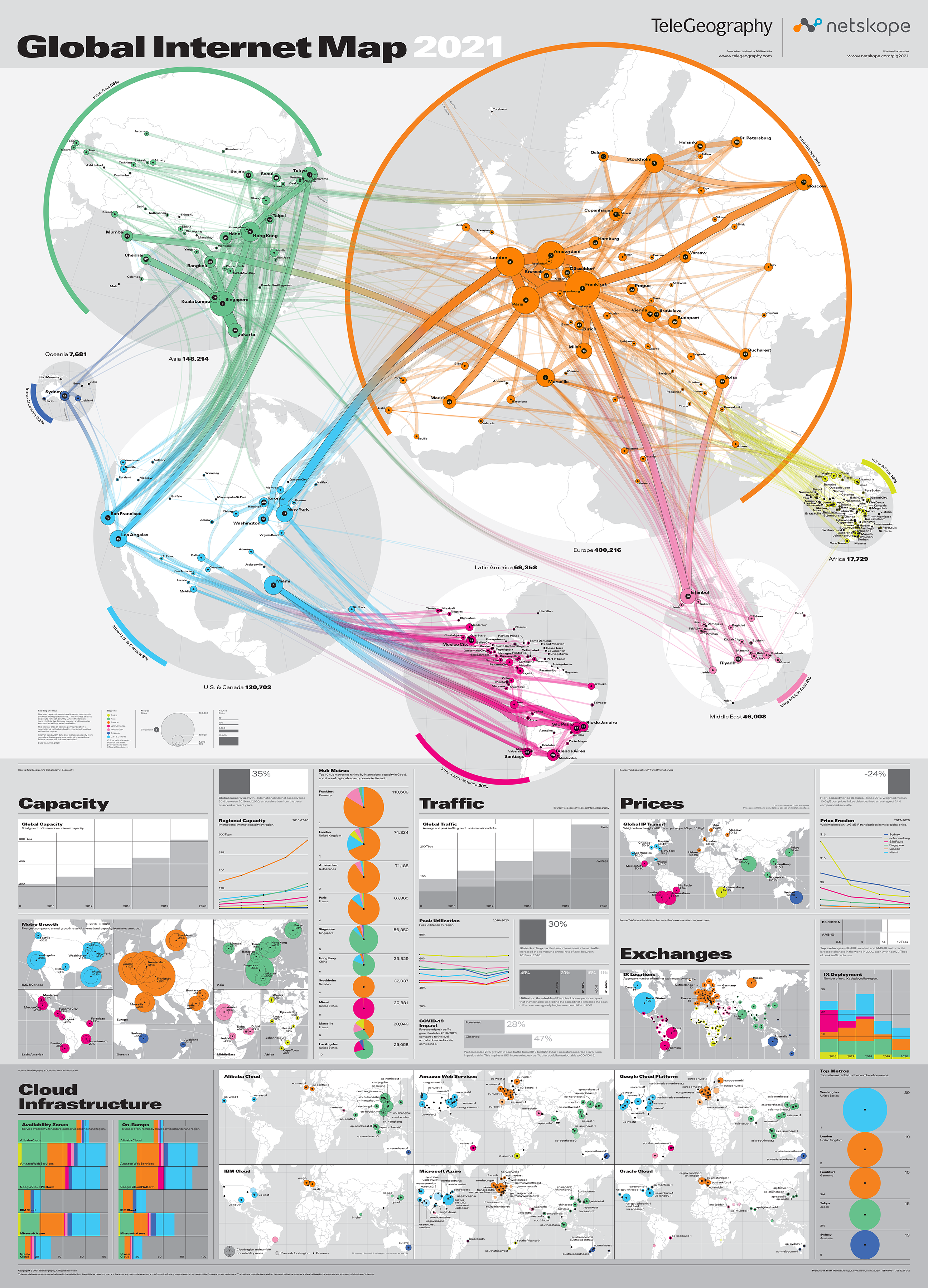
Fans of this map will notice the exciting addition of cloud infrastructure data.
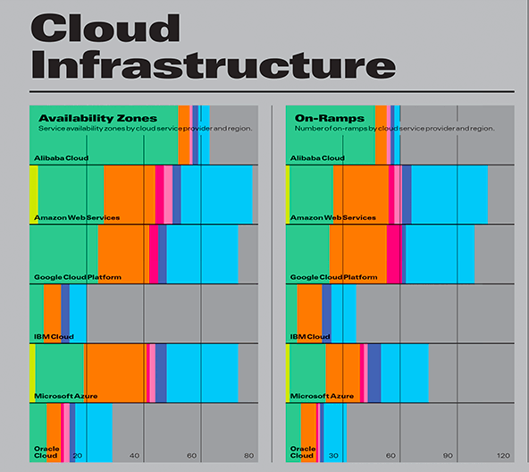
This includes six new cloud service provider maps showing active and planned cloud regions, number of availability zones, and on-ramps.
Per usual, this map also displays key insights into the world’s internet exchanges. These include the aggregate number of exchanges in each country and the number deployed by region over the past five years.
Key projections include intraregional internet bandwidth, metro-to-metro area internet bandwidth, metro area internet bandwidth and the top 50 metro areas ranked.
Our colorful 2021 edition is sponsored by the team at Netskope.
"Netskope is proud to support TeleGeography's 2021 Global Internet Map. We believe a secure and safe internet supports long-term growth and innovation. The disruptions the world saw in 2020 showed the mission-critical nature of the internet and the value it delivers to both businesses and people,” said Joe DePalo, SVP of Platform Engineering at Netskope. “Visibility and insights are vital components of any digital transformation journey, and through the sponsorship of this map we aim to help more businesses respond to global trends and secure their networks.”


0 Post a Comment:
Δημοσίευση σχολίου